The 20/20 Diet App
The 20/20 Diet is a weight-loss program developed by Dr. Phil, a nationally recognized health expert, and television personality. The program is available in the form of the book and companion mobile app.
The app provides customers with a way to track their weight loss progress, stay on top of exercise schedule and log their meals. The built-in library of meal recipes is automatically updated based on the enrolled phase.
The Brief:
Redesign an existing app to fulfill program requirements and improve the user experience. Identify and resolve technical issues. Evaluate competitive landscape of weight loss and fitness apps and develop appropriate functionality to match or surpass long established competitors.
The Work:
I evaluated usability aspect of the app - how it fulfilled program's objectives by providing the user with a set of features necessary to follow the weight loss program in the companion book. This involved understanding of user experience and technical issues related to cross-platform development. Upon suggesting an appropriate course of action, I've redesigned the app from the ground up and delivered an enhanced product that met user needs and allowed customers to continue their program without interruption.
Discovering usability issues.
The client felt that the initial version of the app didn’t fulfill the program’s requirements, was difficult to use and had many technical issues. I was asked to evaluate the current state of the app from the user experience and technical points of view and suggest an appropriate course of action.
The team interviewed stakeholders, conducted user research, and performed usability testing to understand issues with the existing app’s implementation. I've also studied the weight loss program’s structure and evaluated app’s usability attributes, whether it had the functions necessary for users to complete their tasks quickly and accurately.
I evaluated the app along five usability dimensions:
- Effectiveness - was the user able to complete actions necessary to take full advantage of the program.
- Efficiency - was the time it took to complete the tasks was in line with user’s expectations and ability to continue following the program.
- Engagement - was the user experience enjoyable and motivated the user to complete actions on a daily basis.
- Tolerance - did the design of the app encouraged users to maintain the necessary level of personal data to take full advantage of the program.
- Understanding - did the user understand platform’s capabilities and was able to perform necessary functions with ease.
Low fidelity wireframes:
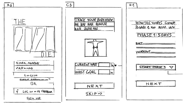
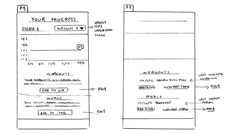
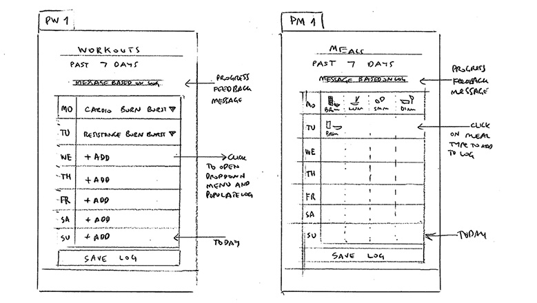
Defining user experience.
I came to a number of conclusions following Discovery stage of the project:
- On a high level, some features that were essential to the participation in the program were missing. We reevaluated the entire user experience and developed a scope of work for features to ensure that all program’s requirements were met.
- Design and user interface elements lacked consistency. For example, data inputs were inconsistent in their form and functionality. Not all user input was properly captured and utilized. We have to redesign the way the user metrics are captured and displayed.
- The visual presentation didn’t represent the sophistication and well-known status of the program. We need to elevate the look and feel of the application to reflect the program’s status in the health and fitness industry.
Based on the above conclusions I suggested and got approved the redesign of the app from the ground up, including the revision of most of the backend services to support the new user experience.
Mockups and prototypes:
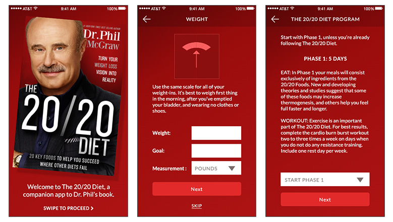
Developing a new user experience.
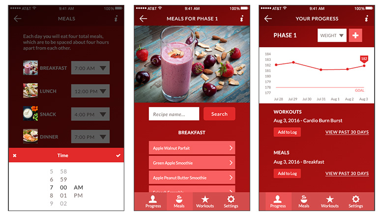
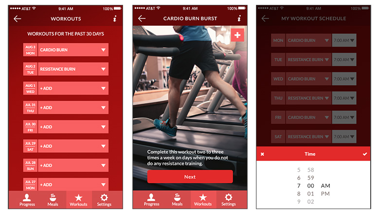
I redesigned the app to allow users to create a workout schedule, log their body measurements, meals, and daily workouts to track progress as they advanced through the phases of The 20/20 Diet. The user experience was enhanced to guide the user through the three phases of the program.
Leading the development team, I supervised the implementation of the following features.
- Notifications remind the user to follow the four meals a day regimen. The Meals section automatically displays the phase-appropriate recipes.
- A new Progress section was created to provide extra motivation to stay on track by prompting to log meals and workouts daily.
- Facebook Login functionality was implemented to simplify the sign-up process.
- On-boarding process was redesigned to explain better how to use the app with The 20/20 Diet program.
- Workout instructions were improved for easier logging of completed workouts.
- Logging of meals was redesigned from scratch.
- “Progress” section became more prominent and always accessible with one click from the main navigation bar.
- It now shows progress graphs for weight, waist measurement, arm measurement etc., along with a milestone maker for the individual user’s goal weight, weight, waist measurement, arm measurement, etc.
- It also displays the last logged workout and meal as a reminder to keep the log up to date.
- “Add to log” buttons allow for quick logging of workouts and meals.
Delivering the new features to existing and new users.
The redesigned app delivered enhanced user experience and provided a set of features that fully represented the program. Once the updated iOS and Android apps were launched, I reviewed user feedback and verified that integrity of user profile data was maintained during the transition.
Tools & Methods:
Stakeholder Interviews, Competitor Research, Sketching/Low Fidelity Wireframes, Adobe XD, Clickable Low Fidelity Prototype, Flowcharts, Mockups, Clickable High Fidelity Prototype, Flurry Analytics.